Mac
Well-known member
- May 3, 2021
- 1,304
- 2,525
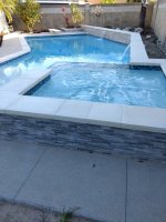
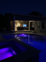
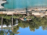
The hot tub is raised and has a full lake view too!Super rad... love how it wraps the house!
-TJ
Last edited by a moderator:
Follow along with the video below to see how to install our site as a web app on your home screen.
Note: This feature may not be available in some browsers.
The hot tub is raised and has a full lake view too!Super rad... love how it wraps the house!
-TJ
If you meant re: my design, yup for sure. The "bar" in the pool renderings is just a generic place holder. Also, the sun sets to the front of the house, so we'll get good shade from that as well as the trailer shade structure that'll go up out past the bar thing on the other side of the lot.For the bar, I would make the roof larger and the bar smaller. I like more shade!
TJGot a few renderings for our backyard in Vegas... but totally changed our minds on the "raised" section. Here's what we had:
View attachment 14515
View attachment 14516
View attachment 14517
View attachment 14518
A couple things. First, the color of the stacked stone was just a place-holder, it'll be more of a grey to match our backyard plans. Second, it needs a big sink plus "bar sink" added (which we had asked for, not sure why it didn't make it in the plan). Third, I think we've decided against the raised sections around the whole thing. Fourth, there are way too many bar stools drawn in the rendering, imagine maybe 2/3rds that many, maybe less. I don't know that many people, and I know there certainly aren't that many people that like me. Initially I really liked it, but the more I looked at it the more it felt like the center bar at a Chilis or Applebee's to me. For context, here's where it's going:
View attachment 14520
View attachment 14519
Those are the pool company's renderings, so totally ignore the style/color of the outdoor kitchen in these.
Any other thoughts or input? I'll have new drawings in the next few days.
-TJ
It's going to be a champagne edge all the way around the spa. On the walls on either side of the spa there is a small water feature too.TJ
On the spa, the way the water spills over are you going float for are you going to do something different?
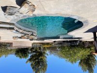
We did ours as a Champagne edge or negative edge. It actually slopes back towards the inside of the pool and creates a negative edge when it spills over. It's cool. What I also like about it is that there is always water on that top portion of the tile and not just sitting in the sun baking the grout. When flat, the water will evaporate and just leave that portion dry till the pool starts up again.
VID_159240904_040309_028.mp4 5.88 MB · 0 downloads
View attachment 14565
Please excuse my spelling errors! I edited just now! :lmao:It's going to be a champagne edge all the way around the spa. On the walls on either side of the spa there is a small water feature too.
-TJ
We seriously need a Super BadAss Button!I live at the beach so I'm the wrong guy to ask on Vegas.
But if you had the Ledge lounger chaises like we are going to get I don't see why not.
Whats the reasoning? The water is too warm?
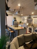
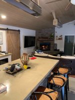
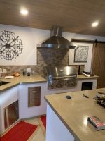
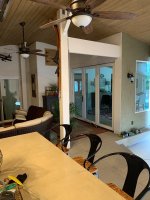
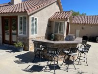
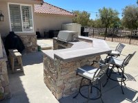
Here's some inspiration to get your ass I to gear, still missing our pendant island lights. Been on backorder since Feb. Just snapped these.
We designed everything in house between the wife and I, and did everything in house between myself and my subs.
Your kitchen looks awesome, some. Some unsolicited advice if you want it, your sink is too far away. I would work that area into a walk in pantry or something, get your sink and DW in the island. Might not be feeble with the shape you're working with but play with it. You want your work are to be a triangle. Fridge, range, and sink.
Whats behind the wall where the range is?
If you need any help you can PM me.
View attachment 14566
View attachment 14567
View attachment 14568
On the pool thing, it's just that there are probably only a few months a year where anybody would sit on the baja step deal... and my wife and I aren't those "somebodies." We've thought it through, kicked around a zillion designs, and I think we're set. I do appreciate all the input though.I live at the beach so I'm the wrong guy to ask on Vegas.
But if you had the Ledge lounger chaises like we are going to get I don't see why not.
Whats the reasoning? The water is too warm?
Here's some inspiration to get your ass I to gear, still missing our pendant island lights. Been on backorder since Feb. Just snapped these.
We designed everything in house between the wife and I, and did everything in house between myself and my subs.
Your kitchen looks awesome. Some unsolicited advice if you want it, your sink is too far away. I would work that area into a walk in pantry or something, get your sink and DW in the island. Might not be feasible with the shape you're working with but play with it. You want your work area to be a triangle. Fridge, range, and sink.
Whats behind the wall where the range is?
If you need any help you can PM me.
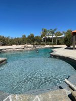
We did White Plaster.What color/brand is your plaster? Looks great.
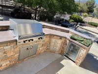
If you are in need of the grill and components I have great prices! Thanks! - cell is 951-316-8793Got a few renderings for our backyard in Vegas... but totally changed our minds on the "raised" section. Here's what we had:
View attachment 14515
View attachment 14516
View attachment 14517
View attachment 14518
A couple things. First, the color of the stacked stone was just a place-holder, it'll be more of a grey to match our backyard plans. Second, it needs a big sink plus "bar sink" added (which we had asked for, not sure why it didn't make it in the plan). Third, I think we've decided against the raised sections around the whole thing. Fourth, there are way too many bar stools drawn in the rendering, imagine maybe 2/3rds that many, maybe less. I don't know that many people, and I know there certainly aren't that many people that like me. Initially I really liked it, but the more I looked at it the more it felt like the center bar at a Chilis or Applebee's to me. For context, here's where it's going:
View attachment 14520
View attachment 14519
Those are the pool company's renderings, so totally ignore the style/color of the outdoor kitchen in these.
Any other thoughts or input? I'll have new drawings in the next few days.
-TJ